- Generating plots
- List of available plots
- Exporting plots and setting plot-related preferences
- Plots settings
Generating plots
Diagnostic plots can be generated by clickin on the task “Plots” or as part of the scenario when clicking on Run. By default, when reloading a project which has already run, only the plots Observed data and Covariate viewer are displayed. To generate the other diagnostic plots, click on the Plot task. Generating plots automatically at project load can be enabled via a Preference.
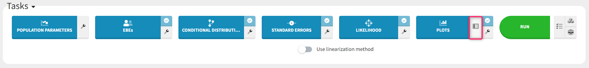
The set of plots to compute can be selected by clicking on the button next to the task as shown below, prior to running the task.
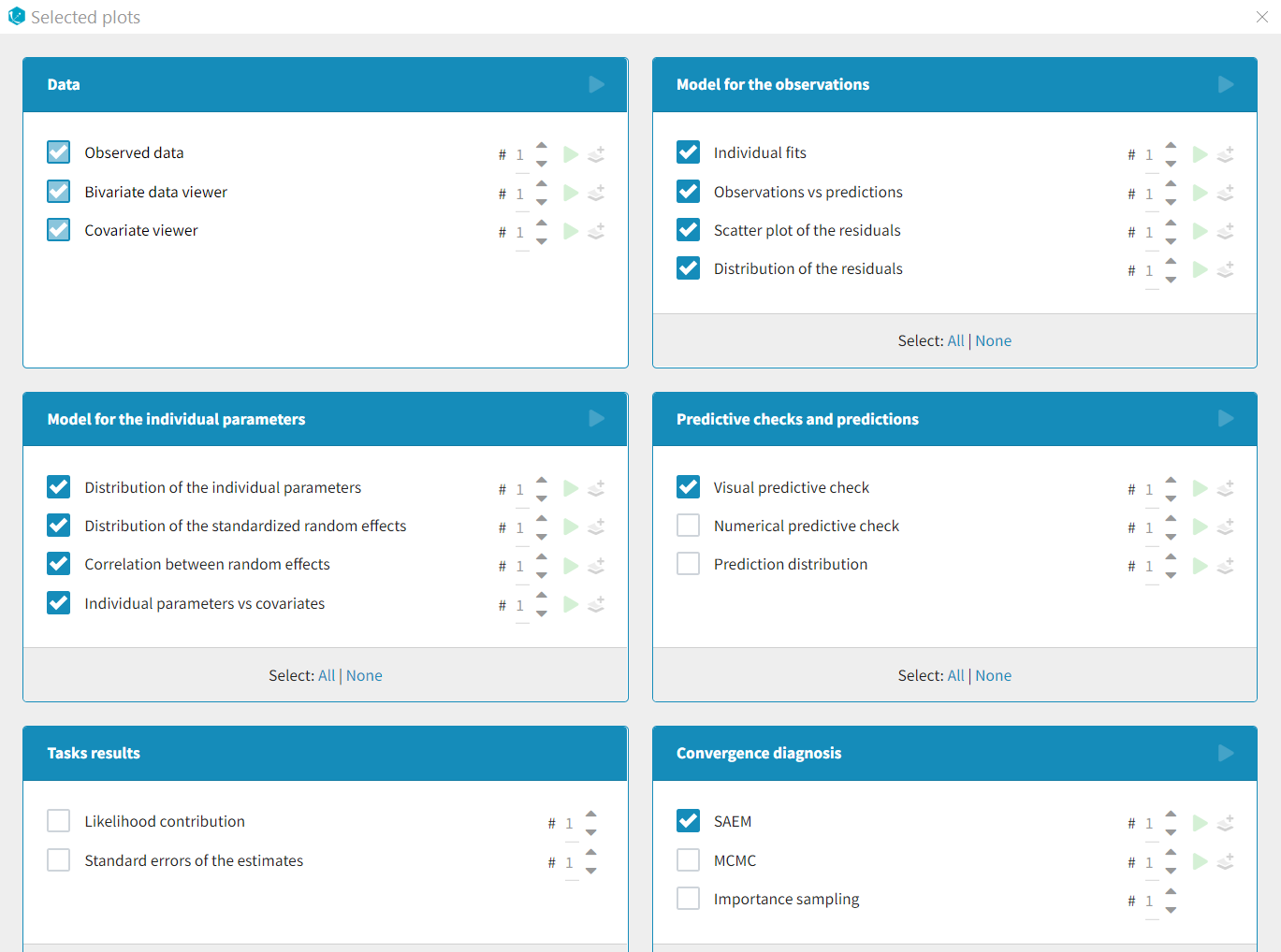
By default, only a subset of plots are selected (see below), with one occurence for each plot. The number of occurences can be selected via the number selection box. Having several occurences of the same plot allows to choose different settings for each occurence, for instance one on linear scale and and one on log scale. The plot selection and number of occurences is saved as part of the mlxtran file upon save, and reapplied at project reload.
The green arrow can be used to generate only one plot type with the given number of occurences without re-generating all other plots. The “+” button allows to add one additional occurence. If the information necessary to generate a plot is not available, these buttons are hidden.
List of available plots
Data
- Observed data: This plot displays the original data w.r.t. time as a spaghetti plot, along with some additional information.
Model for the observations
- Individual fits: This plot displays the individual fits: individual predictions using the individual parameters and the individual covariates w.r.t. time on a continuous grid, with the observed data overlaid.
- Observations vs predictions: This plot displays observations w.r.t. the predictions computed using the population parameters or the individual parameters.
- Scatter plot of the residuals: This plot displays the PWRES (population weighted residuals), the IWRES (individual weighted residuals), and the NPDE (Normalized Prediction Distribution Errors) w.r.t. the time and the prediction.
- Distribution of the residuals: This plot displays the distributions of PWRES, IWRES and NPDE as histograms for the probability density function (PDF) or as cumulative distribution functions (CDF).
Diagnosis plots based on individual parameters
- Distribution of the individual parameters: This plot displays the estimated population distributions overlaid with a histogram of the individual parameters
- Distribution of the random effects: This plot displays the estimated populated distribution of the random effects overlaid with a histogram of the random effects derived from the individual parameters.
- Correlation between random effects: This plot displays scatter plots for each pair of random effects.
- Individual parameters vs covariates: This plot displays the individual parameters or random effects w.r.t. the covariates.
Predictive checks and predictions
- Visual predictive checks: This plot displays the Visual Predictive Check.
- Numerical predictive checks: This plot displays the numerical predictive check.
- BLQ predictive checks: This plot displays the predicted and observed proportion of censored data w.r.t. time.
- Prediction distribution: This plot displays the prediction distribution.
Convergence diagnosis
- SAEM: This plot displays the convergence trajectories of the population parameters estimated with SAEM with respect to the iteration number.
- MCMC: This plot displays the convergence of the Markov Chain Monte Carlo algorithm for the individual parameters estimation.
- Importance sampling: This plot displays the convergence of log-likelihood estimation by importance sampling.
Tasks results
- Likelihood contribution: This plot displays the contribution of each individual to the log-likelihood.
- Standard errors for the estimates: This plot displays the relative standard errors (in %) for the population parameters.
Exporting plots and setting plot-related preferences
Several features can be used to export plots or plot data or create plots automatically:
- Saving a single plot as image (icon button)
- Create plots at project load (Preference)
- Save charts data as binary file (Preference)
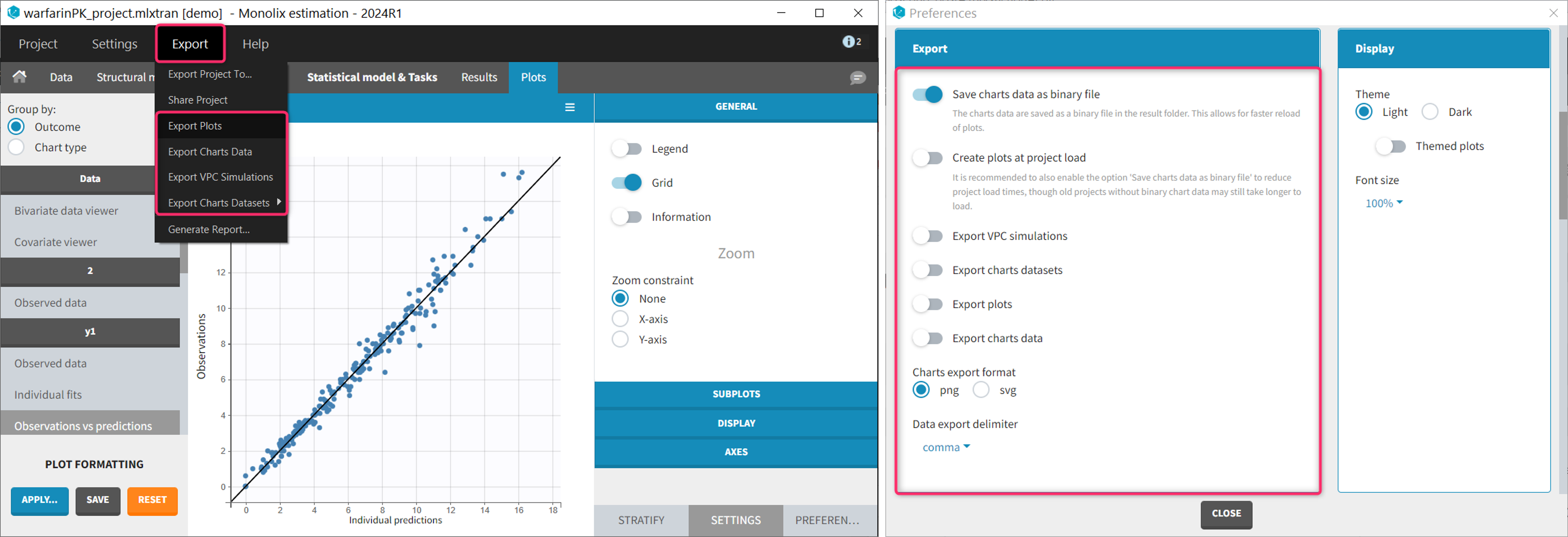
- Export VPC simulations (Preference and Export menu)
- Export charts datasets (Preference and Export menu)
- Export plots (Preference and Export menu)
- Export charts data (Preference and Export menu)
Each feature is detailed below in this section.
Most of them are located:
- in the Export menu: to export the plots as image file or a text files for a single project.
- in the Preferences: to export the plots as image file or a text files automatically at the end of each plot generation task. Preferences are user-specific and apply to all projects. The preferences are saved in C:\Users\<username>\lixoft\monolix\monolixXXXXRX\config\config.ini.
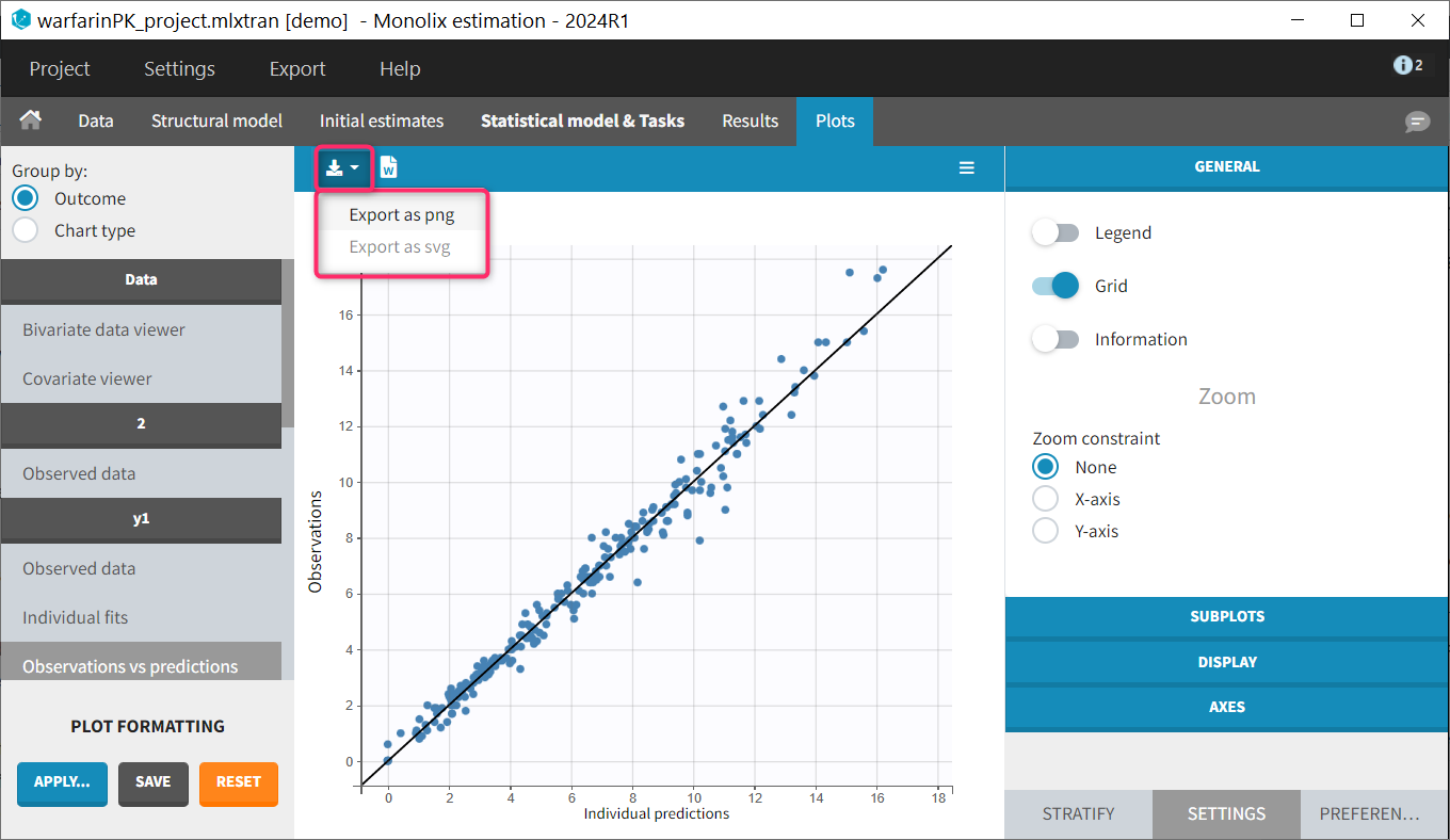
Saving a single plot as image (icon button)
The user can choose to export each plot as an image with an icon on top of the plot, choosing between png and svg format. The files are saved in <result folder>/ChartsFigures with the name of the plot, the observation name (e.g y1 or y2) and a postfix indicating the plot occurence, and page number. Note that information frames are not exported. The icon becomes available only when a structural model has been selected.
Create plots at project load (Preference)
By default, when a project which has already run is re-opened, only the plots “Observed data” and “Covariate viewer” are displayed. To generate the other diagnostic plots, it is necessary to click on the “Plots” task. Note that it is not necessary to rerun the entire scenario of all tasks.
Starting with version 2024, it is possible to choose whether plots should be created automatically at project load. This option is available in Settings > Preferences > Create plots at project load. When this option is “on”, plots are generated when opening a project with results. Note that this increases the load time, in particular if the charts data have not been saved as binary (see below). By default, the option is “off”.
Save charts data as binary file (Preference)
Generating the plots can take several minutes depending on the model and dataset, because it requires to redo the simulations used in the VPC for instance. Starting with version 2024, it is possible to save the charts data (in particular the simulations) as a binary file, which is re-used when the plots are re-generated. This greatly speeds up the time necessary to generate the diagnostic plots. This option is available in Settings > Preferences > Save charts data as binary file. When this option is “on” (default), the charts data are saved in a non-human-readable format in <result folder>/ChartsData/.Internals/chartsData.dat each time the plots are generated. At project reload, if the file chartsData.dat exists and is valid, it is used to generate the plots faster.
Export VPC simulations (Preference and Export menu)
Simulations used to generate the VPC plot can be exported as txt file. This allows to replot the VPC with an external software for instance. If this export is required for a single project, the user can click Export > Export VPC simulations. The simulations are saved in <result folder>\ChartsData\VisualPredictiveCheck\XXX_simulations.txt. If the user wishes to do this export each time the VPC plot is generated, the option Settings > Preferences > Export VPC simulations can be set to “on”.
Export charts datasets (Preference and Export menu)
Simulations used for the VPC and the Individual fits (prediction on a fine time grid) can be exported as MonolixSuite-formatted datasets (including dose records, regressors, etc). This is useful if these simulations need to be loaded in another MonolixSuite application such as PKanalix for instance. To export these formatted simulations once use Export > Export Charts Datasets > VPC or Individual fits. A pop-up window will let you choose the name and location of the saved files.
To export the simulations as formatted dataset systematically each time the plots are generated, the option Settings > Preferences > Export charts datasets can be set to “on”. The files are saved in <result folder>/DataFile/ChartsData/indfits_data.csv and vpc_data.csv.
Export plots (Preference and Export menu)
Plots can be saved as image files. To save a single plot, use the icon on the top of the plot (see section above). To save all plots for a single project, use Export > Export plots. To systematically save all generated plots as image file, set the the option Settings > Preferences > Explot plots to “on”. The files are saved in <result folder>/ChartsFigures with the name of the plot, the observation name (e.g y1 or y2) and a postfix indicating the plot occurence, and page number. The files are saved at the end of the plot generation task. The file format (png or svg) can be chosen in the Preferences. Note that information frames are not exported.
Export charts data (Preference and Export menu)
The values used to draw the plots can be saved as txt files. This can be useful to regenerate the plots using an external tool. To export the charts data for a single project, use Export > Export charts data. To systematically export the charts data at the end of the plot generation, set the the option Settings > Preferences > Explot charts data to “on”. The files are saved in <result folder>/ChartsData with one subfolder per plot. The content of each file is described on the dedicated page. The file separator can be chosen in the Preferences.
Plot settings
A few plot settings impact the simulations required for the plots. They can be chosen in the Settings panel for the Plots task.
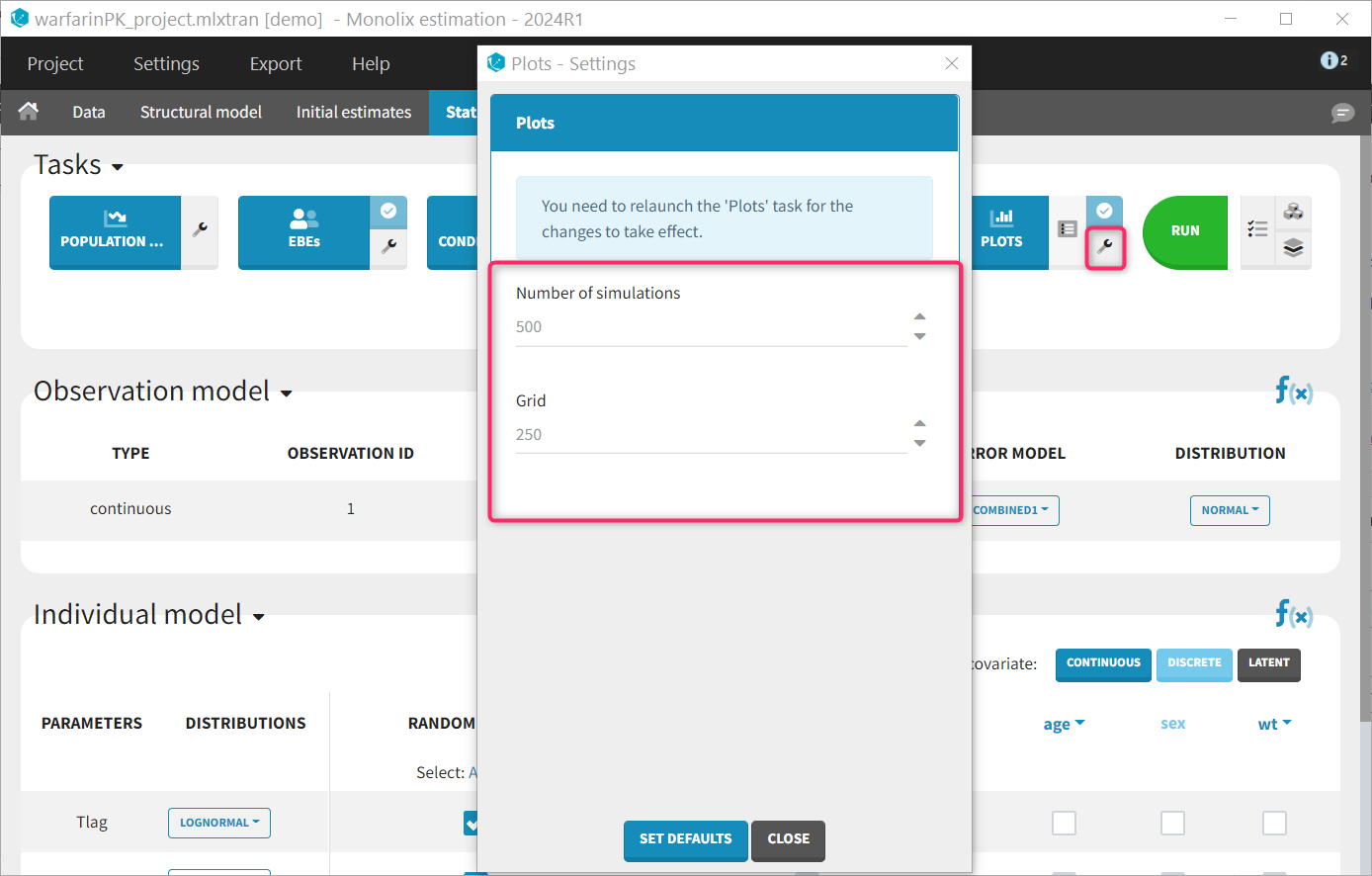
- Number of simulations: number of replicates simulated for the VPC, NPC and Prediction distribution plot (default: 500)
- Grid: number of points of the fine time grid used for the individuals fits (default: 250). See the video below for more details.