- Purpose
- Examples
- Details
- Settings
- Generating predictive checks on an external data set
- Exporting VPC simulations
- Correcting the VPC for missing observations
- Troubleshooting
Purpose
The VPC (Visual Predictive Check) offers an intuitive assessment of misspecification in structural, variability, and covariate models. The principle is to assess graphically whether simulations from a model of interest are able to reproduce both the central trend and variability in the observed data, when plotted versus an independent variable (typically time). It summarizes in the same graphic the structural and statistical models by computing several quantiles of the empirical distribution of the data after having regrouped them into bins over successive intervals.
More precisely, the goal is to compare the two following elements:
- Empirical percentiles: percentiles of the observed data, calculated either for each unique value of time, or pooled by adjacent time intervals (bins). By default, the 10th, 50th and 90th percentiles are displayed as green lines. These quantiles summarize the distribution of the observations.
- Theoretical percentiles: percentiles of simulated data are computed from multiple Monte Carlo simulations with the model of interest and the design structure of the original dataset (i.e., dosing, timing, and number of samples). For each simulation, the same percentiles are computed across the same bins as for empirical percentiles. Prediction intervals for each percentile are then estimated across all simulated data and displayed as colored areas (pink for the 50th percentile, blue for the 10th and 90th percentiles). By default, prediction intervals are computed with a level of 90%.
If the model is correct, the observed percentiles should be close to the predicted percentiles and remain within the corresponding prediction intervals.
Examples
VPCs vary slightly for different types of data. For joint models for multivariate outcomes, VPCs are available for each outcome.
- Continuous outcomes
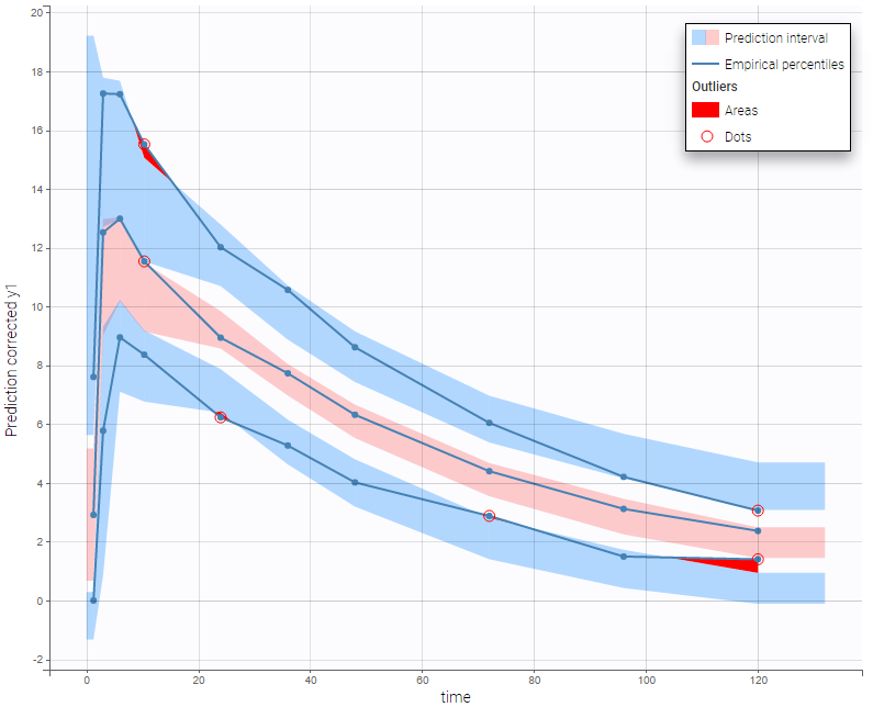
warfarinPK_project (data = ‘warfarin_data.txt’, model = ‘lib:oral1_1cpt_TlagkaVCl.txt’)
In the following example, the parameters of a one-compartment model with delayed first-order absorption and linear elimination are estimated on the warfarin dataset. A constant residual error model was used. The figure presents the VPC with the prediction intervals for the 10th, 50th and 90th percentiles. Outliers are highlighted with red dots and areas. Here the three quantiles appear closer together than the model would suggest, therefore the VPC suggests that a proportional component should be added to the error model.
Since version 2024, there are options for displaying the x-axis using either nominal time, time after the last dose or regressors, if they are available in the dataset and appropriately tagged. You can choose these options within the x-axis settings of the plot settings.
For joint models for continuous PK and time-to-event data, VPCs are available for each type of data. However it is important to note that dropout events are not taken into account in the VPC corresponding to the continuous data. Therefore, in the case of non-random dropout events in the dataset, this can result in discrepancies between observed and simulated data and thus hamper the diagnosis value of the VPC. Correcting this bias would require to include the simulated dropout in VPC, as well as adapt the design structure to compensate observed dropouts, an approach that is problematic when the design structure is complex. More details on this approach are given here.
- Non-continuous outcomes: count data and categorical data
VPCs for count data and categorical data compare the observed and predicted frequencies of the categorized data over time. The predicted frequency is associated with a blue prediction interval.
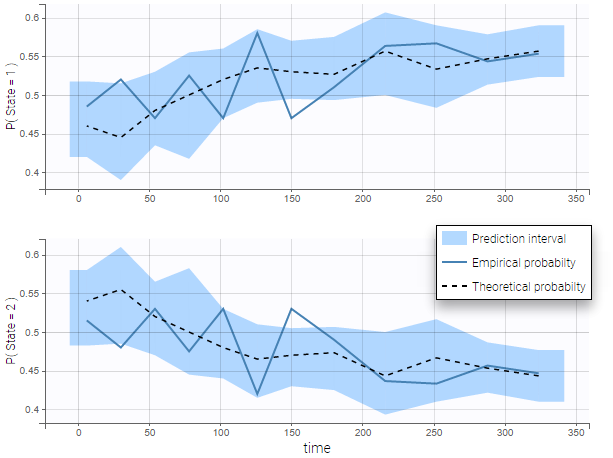
The following figure shows the VPC for a project with a continuous time Markov chain model and time varying transition rates.
- markov3b_project (data = ‘markov3b_data.txt’, model = ‘markov3b_model.txt’)
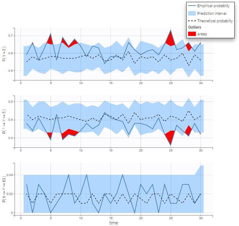
In addition to the categorization over time (binning on X), count data are also binned into groups of count values on the VPC (binning on Y). The number of bins and binning method can be set in Settings under “Y Bins”.
As an example, the VPC below corresponds to a project where a Poisson model is used for fitting the data. Observations are binned in 3 groups on the Y axis and 20 bins on the X axis.
- count1a_project (data = ‘count1_data.txt’, model = ‘count_library/poisson_mlxt.txt’)
- Time-to-event data
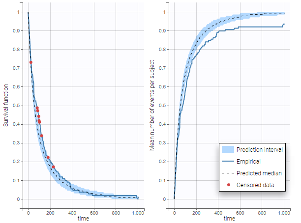
In case of time-to-event data, two visual predictive checks are available, survival function based on the Kaplan-Meier plot for exactly observed events and the Turnbull estimator for the interval censored data, and the mean number of events per individual using Turnbull estimation (see here and here for reference papers).
Details on the VPC for TTE generation in Monolix are presented here.
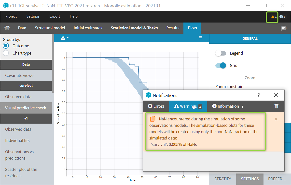
The example below shows these two figures, computed with a model for the survival of patients with advanced lung cancer from the Veterans’ Administration Lung Cancer study. Censored data has been selected and displayed on the Kaplan-Meier plot. Note that censored data also cause an over prediction bias in the VPC based on the mean number of events per individual, because censored individuals contribute to the prediction interval but not to the empirical curve.
Sometimes numerical errors can appear in the simulations used for the TTE VPC. For example, when simulating a joint model with tumor growth and survival over a long time scale, the simulated hazard for death can become too high for some individuals at high times. In Monolix2021R1, the appearance of NaNs in the VPC simulations does not stop the generation of the VPC. The simulated individuals with NaNs in their simulations are not used in the prediction interval, and the percentage of simulated individuals with NaNs is then displayed in the Warnings.
Details
- Binning criteria
Correctly defining the intervals (or bins) into which the data are grouped is crucial to construct a VPC that avoids distortion between the original and approximated distributions. Several strategies exist to segment the data: equal-width binning, equal-size binning, and a least-squares criterion. The number of bins can also be either set by the user, or automatically selected to obtain a good tradeoff. Indeed, a small number of bins leads to a poor approximation but a good estimation of the data’s distribution, while a large number of bins leads to a good approximation but poor estimation.
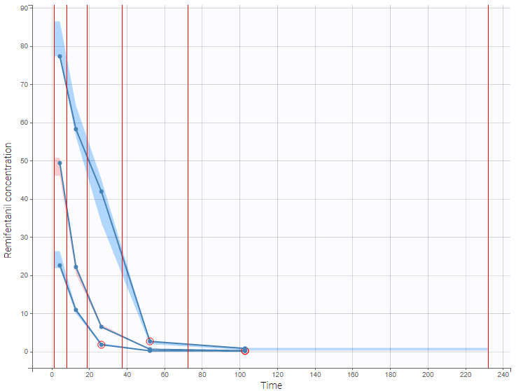
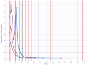
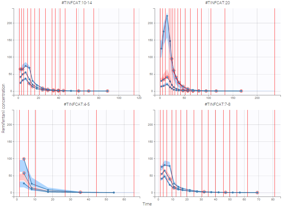
As an example, the VPCs below are computed on the PK model built for remifentanil pharmacokinetics, a dataset that involves a large variability in doses. The bins are delimited with vertical lines. The first VPC on the left is computed with 5 bins, the number automatically selected for this dataset. On the other hand, the second VPC on the right is computed with 15 bins. We notice that in this case the heterogeneity of the data results in a poor estimation of the data’s distribution. To keep a good estimation, a small number of bins is required, but the approximation then prevents from visualizing the kinetics in details. The absorption phase is for example not visible.
- Corrected predictions
As shown above, VPCs can be misleading if applied to data that include a large variability in dose and/or influential covariates, or that follow adaptive designs such as dose adjustments. The prediction-corrected VPC (pcVPC), with prediction correction, was developed to maintain the diagnosis value of a VPC in these cases. In each bin, the observed and simulated data are normalized based on the typical population prediction for the median time in the bin. Formulae are applied as in the publication from Bergstrand et al. In the simple case of normally distributed observations and a zero lower bound for observations, we get:
\[ pcY_{ij} = Y_{ij} \frac{\tilde{PRED}_{bin}}{PRED_{ij}} \]
where
- Yij : observation or prediction for the ith individual and jth time point,
- pcYij : prediction-corrected observation or prediction,
- PREDij: typical population prediction for the ith individual and jth time point
- PRẼDij: median of typical population predictions for the specific bin of independent variables.
This removes the variability coming from binning across independent variables.
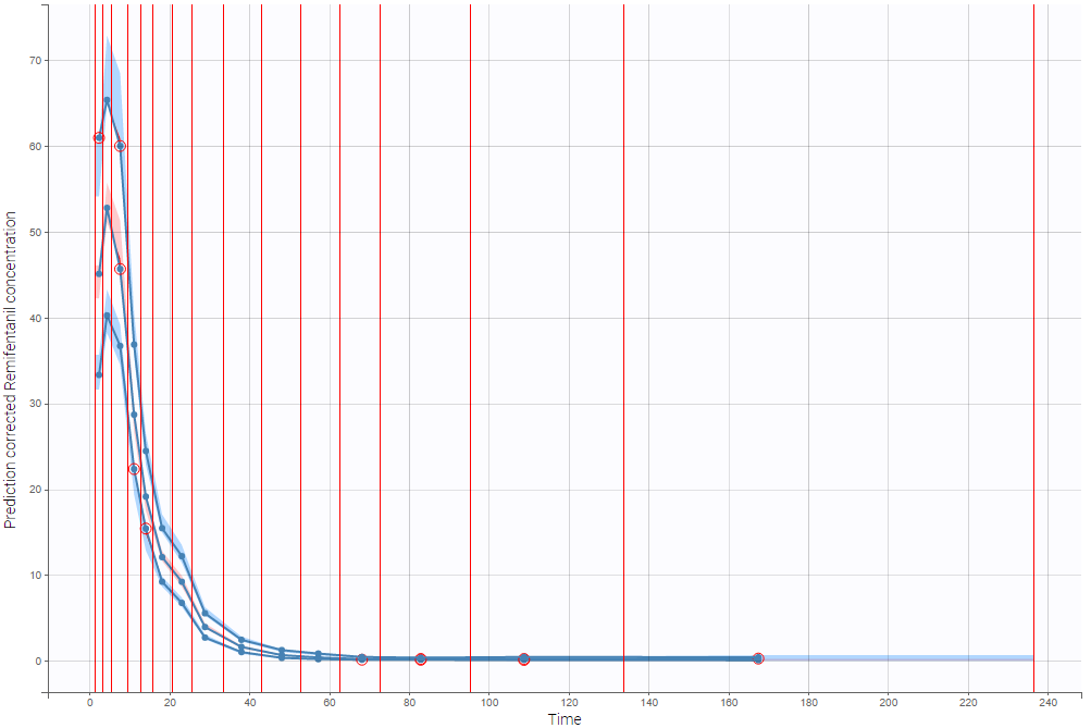
The example below shows the pcVPC computed on the PK model built for remifentanil pharmacokinetics with 15 bins: the figure now gives a good estimation of the data’s distribution, including the absorption phase.
- Stratification
When possible, another useful approach to deal with heterogeneous data can be to split the VPC into groups of subjects that are more homogeneous. As an example, the VPCs below are computed again on the PK model built for remifentanil pharmacokinetics, with 15 bins, but the data was first split by a categorical covariate that characterizes groups of similar doses.
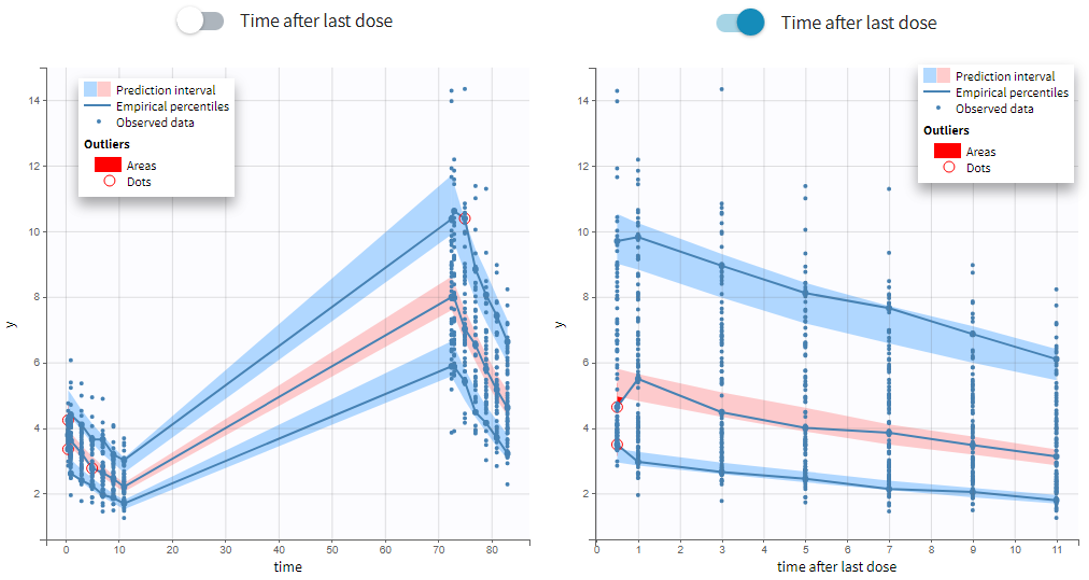
- VPC based on time after last dose (continuous data only)
Option in the display panel “Time after last dose” displays the VPC with data for times (the X-axis) after last dose (for Monolix versions 2021 and above). Below is an example with result for the demo project multidose_project.mlxtran (Monolix demo folder 6.3). Observed data overlaid the VPC. On the left image the X-axis is “Time”, and on the right the X-axis is “Time after last dose”. The exported charts data for the VPC include two columns for time and time after last dose – independently of the option selected in the interface. Doses with amount=0 are handled as the others. For observations before the first dose (or if no doses at all), time remains unchanged (i.e time after last dose = time). Finally, all administration ids are handled together (it is not possible to define time after dose for adm id = 2 only for instance).
- Axis limits
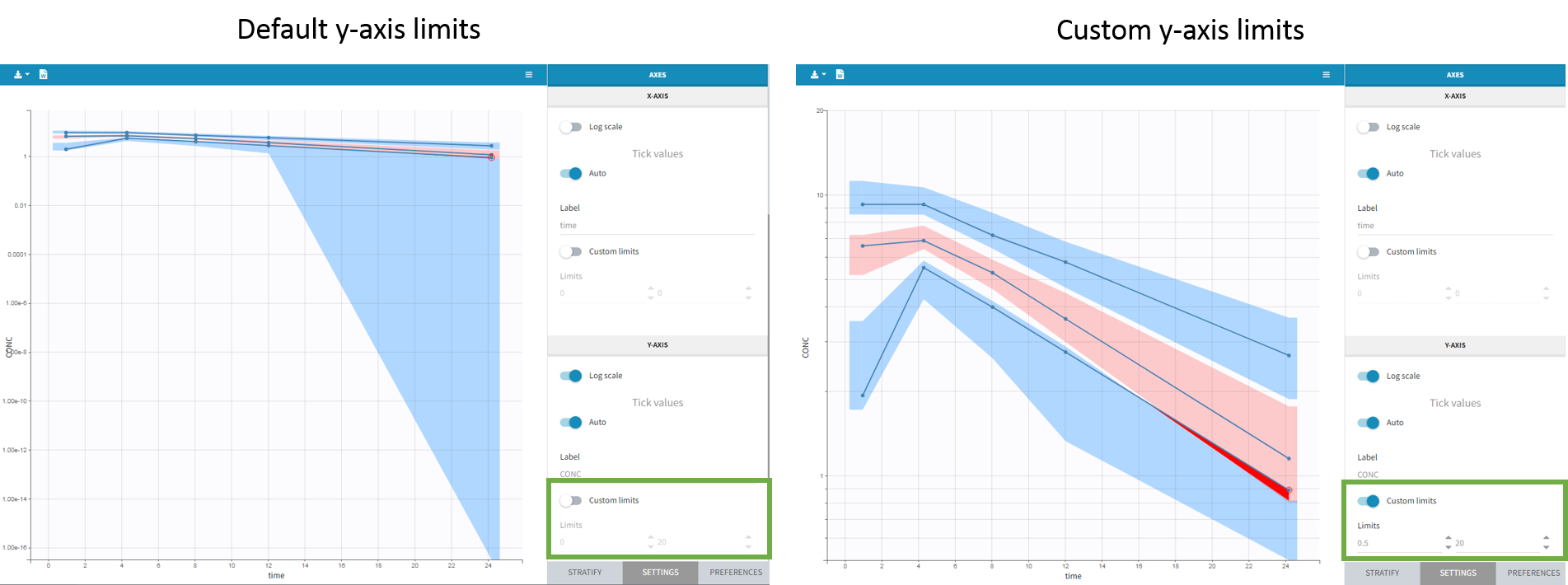
From the 2023 version on, the user can choose the axis limits manually. This is particularly convenient when the prediction intervals go into negative values and log-scale is used on the y-axis. In that case, the VPC is shown by default from 1e-16 to the maximum value, which leads to an unreadable plot. After toggling the setting “custom limits” on, the axis limits can be selected by the user. As the other plot settings, the axis limits are copied to the placeholders when preparing a report.
Settings
- General: Add/remove legend or grid
- Subplots (for TTE data)
- Add/remove plot for survival function (Kapan-Meier plot) or plot for mean number of events per individual
- Add/remove plot for survival function (Kapan-Meier plot) or plot for mean number of events per individual
- Display
- Observed data
- Observed data: Add/remove observed data.
- BLQ: Add/remove BLQ data if present.
- Use BLQ: Choose to use BLQ data or to ignore it to compute the VPC. BLQ data can be simulated, or can be equal to the limit of quantification (LOQ). The latter case induces strong bias .
- Empirical percentiles: Add/remove empirical percentiles for the 10%, 50% and 90% quantiles.
- Predicted percentiles: Add/remove theoretical percentiles for the 10% and 90% quantiles.
- Prediction interval: Add/remove prediction intervals given by the model for the 10% and 90% quantiles (in blue) and the 50% quantile (in pink).
- Set interpercentile level and higher percentile for prediction intervals (for continuous data by default the level is 90 and the higher percentile is 90%), or number of bands for TTE data
- Outliers
- Dots: Add/remove red dots indicating empirical percentiles that are outside prediction intervals
- Areas: Add/remove red areas indicating empirical percentiles that are outside prediction intervals
- Calculations
- Observed data
-
-
- Corrected predictions: compute the pcVPC using Uppsala prediction correction (see details above)
- Linear interpolation: Set piece wise display for prediction intervals (by default the display is linear)
- Time after last dose: Use time after last dose instead of time on the X-axis.
-
- Bins – for categorical data, X Bins and DV Bins (for Y axis) can be specified
- Bin limits: Add/remove vertical lines on the scatter plots to indicate the bins.
- Binning criteria: Choose the bining criteria among equal width (default), equal size or least-squares
- Number of bins: Choose a fixed number of bins or a range for automatic selection, and a range for the number of data points per bin.
- Axes
- Label: nore that “prediction corrected” and “after last dose” are added automatically when chooseing these settings and cannot be removed
- Log-scale
- Variable for x-axis: time, time after last dose (time relative to the previous dose), or regressor from the dataset
- Axis limits
All colors, points and lines can be modified by the user.
Generating predictive checks on an external data set
This video shows how to generate an external VPC in Monolix: a VPC that compares the simulations based on a population model estimated on a first data set to a second data set, for example to check whether a population model estimated on a single dose study is also valid on a new multiple dose study for the same molecule.
Exporting VPC simulations
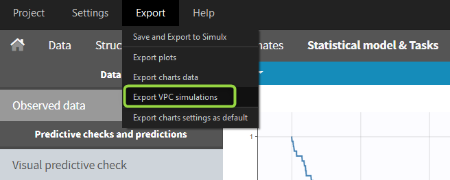
When exporting the charts data, by default the charts data for the VPC include the observed data and predicted percentiles, but not the detailed simulations, which are usually quite large. Starting from the 2020 version, the user can nonetheless choose to include the VPC simulations by clicking on “Export > Export VPC simulations” in the application menu:
The simulated values are saved in <result folder>/ChartsData/VisualPredictiveCheck/XXX_simulations.txt. They can be used to replot the VPC in R for instance.
In Monolix2021 it is also possible to include systematically the VPC simulations in the exported charts data with an option in the Preferences: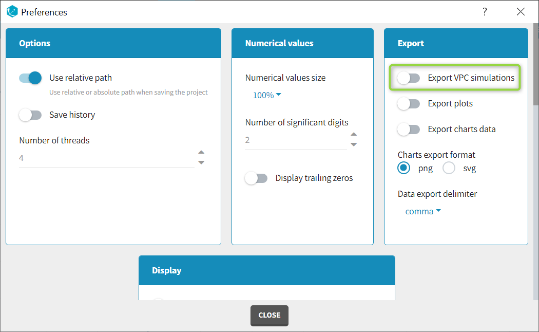
Correcting the VPC for missing observations
Missing observations can cause a bias in the VPC and hamper its diagnosis value. This page discusses why missing censored data or censored data replaced by the LOQ can cause a bias in the VPC, and how Monolix handles censored data to prevent this bias. It also explains the bias resulting from non-random dropout, and how this can be corrected with Simulx.
Troubleshooting
If the VPC plot is emtpy or with non-appropriate axis limits, follow the procedure below.
![]()
The problem appears after having clicked “Export > Export charts settings as default” on a previous project where the y-axis limits were different and this is now applied as default. It is possible to delete the default setting corresponding to the axis limits in the following way:
-
- Open the file C:/Users/<username>/lixoft/monolix/monolix2023R1/config/settings.default in a text editor
- Delete the following lines:
VPCContinuous\yInterval= ...
outputPlot\yInterval= ...
- Save the file
- Reopen your project